Two people read the same page and neither is the other: whoever pays and whoever attends. The site has to answer the practical questions of the first — cost, term dates, how to get there — without boring the second.
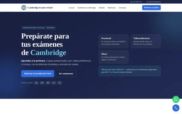
With no dates, a course looks like a course that does not exist. Next start, places left and the application deadline belong at the top of the page, not inside a PDF brochure.
What people are buying is what comes after: the certificate, who recognises it, and whether the course can be funded. Said plainly it turns a browse into an application; left vague it turns into a call nobody makes.
Group size and who teaches decide more enrolments than the syllabus. Twelve to a class with a named teacher is a different product from thirty with an unnamed one, and only one of the two is worth saying out loud.
Word of mouth now starts online: your next customer "checks you out" on Google before setting foot in your community centre. A polished website tips the balance your way. We design it with that single goal: that neighbours book a room and see what is on.
Your community centre website isn't just a shop window: it includes room hire and activity timetable and everything your business needs — the timetable of activities and classes, who runs it and how to get involved — integrated and easy to manage. Fewer calls, fewer gaps in your calendar, more customers.
Your website will look flawless on social media and WhatsApp too: we take care of preview images, copy and speed, so every time you share your community centre it makes a good impression and adds customers.
Reviews and your Google profile decide many visits to a community centre. We work your Google Business Profile, reviews and website SEO together, so when people search for you in your city, you appear — first and well rated.